The Visibox Interface
When you launch a Visibox Project, you see two windows: the Controller Window and the Output Window. Let’s take a look at the features of both.
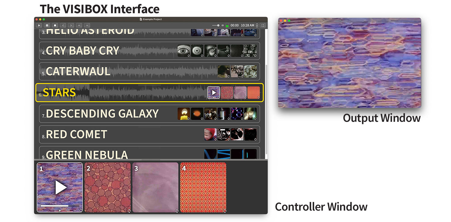
Controller Window
The Controller Window is where you add and arrange the Songs and Clips that make up your Project. It is also used during the performance to see what Clip is currently playing or to select particular Songs and Clips. During a performance, the Controller Window would typically be on a display that only the performer can see, such as a laptop computer.
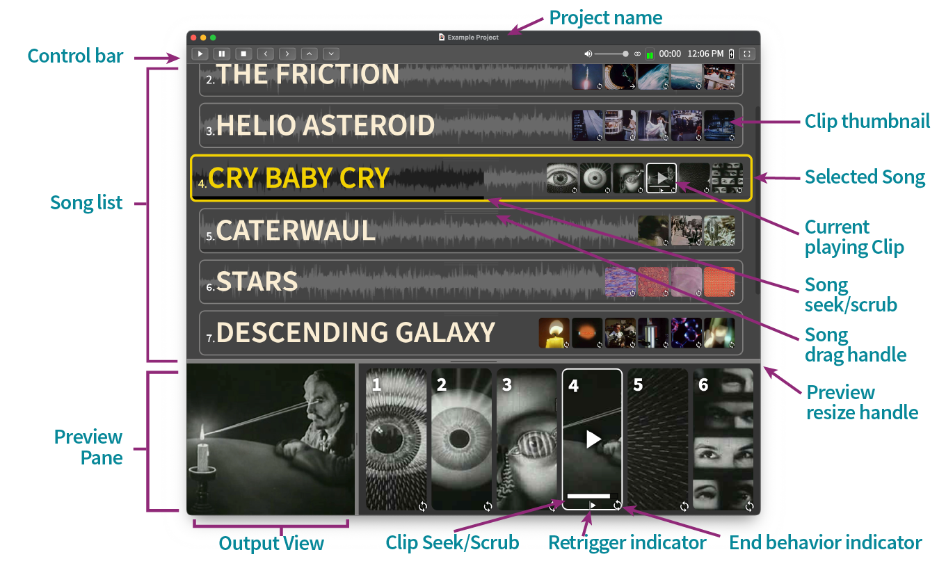
The Control Bar
At the top of the Controller Window is the Control Bar. This allows quick access to transport controls, readouts, and information that may be helpful to have during a performance. You can enable and disable the Control Bar in the Settings submenu.

The left side of the Control Bar contains transport buttons:
| Button | Description |
|---|---|
| Play | Starts playback of the first Clip in the selected Song. |
| Pause | Pauses playback of the currently playing Clip. |
| Stop | Stops playback of the currently playing Clip. |
| Previous Clip | Plays the previous Clip in the selected Song. |
| Next Clip | Plays the next Clip in the selected Song. |
| Previous Song | Cues the previous Song in the Project. |
| Next Song | Cues the next Song in the Project. |
The center of the Control Bar contains the Find box for quick navigation.
Find
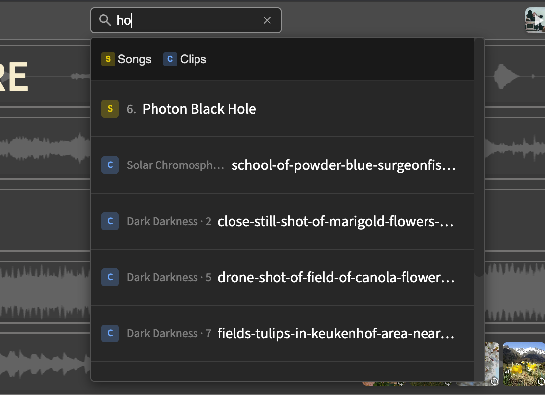
The Find box lets you quickly jump to any Song or Clip in your Project. Type a few letters of a Song title or Clip filename and matching results appear instantly. This is especially useful for large Projects with many Songs.
To use Find:
- Click in the Find box or press the keyboard shortcut to focus it
- Start typing to search—results appear as you type
- Use the Up/Down arrow keys to move between results
- Use the Left/Right arrow keys to choose an action for the selected result
- Press Enter to execute the selected action, or click directly on an action button
Each result shows action buttons on the right:
For Songs:
| Button | Description |
|---|---|
| Activate | Makes this Song the active Song (stops any currently playing Clip by default, or hold Shift to keep it playing) |
| Trigger | Activates the Song and immediately plays its first Clip |
| Show | Scrolls the Song into view and highlights it briefly |
For Clips:
| Button | Description |
|---|---|
| Trigger | Activates the Clip’s Song and plays the Clip |
| Show | Scrolls the Clip into view and highlights it briefly |
You can filter results to show only Songs or only Clips by clicking the S (Songs) or C (Clips) buttons at the top of the dropdown. Your filter preference is remembered across searches.
Find uses “fuzzy” matching, so you don’t need to type the exact name. Typing “intro” will find “Introduction Video”, “Intro Music”, or anything else containing those letters.
The right side of the Control Bar contains readouts and information.
| Control | Description |
|---|---|
| Background Clip | Shows whether the current Project has a Background Clip assigned, with a thumbnail preview and playing status. Click to add, remove, or change Background Clip options. |
| Master Volume | This slider allows you to set the audio level of Visibox. |
| Imaging | Click to switch the audio from stereo to mono or multichannel. |
| Audio Level | Visual indicator of audio playing in Visibox. |
| Resource Meter | Shows CPU usage levels for both the system and Visibox. Hover to view detailed information in a tooltip. |
| Stopwatch | Click to start, stop, reset the timer. |
| Time | The current time of day. Click to adjust readout settings. |
| Battery Level | Current battery level with indicator for charging status. The Control Bar changes color on battery and flashes when power is low. |
| Panic Button | (Only available in full-screen.) Reloads windows when clicked. Press to reload all windows if anything goes awry. |
| Swap Presentation Displays | (Only available in full-screen.) Controller/Output appearing on the wrong screens? Click to swap the displays. |
| Full Screen Button | Click to enter or exit full-screen mode. |
Tooltips
Hovering over elements in the Controller Window displays tooltips with helpful information. Clips show detailed metadata including filename, dimensions, duration, frame rate, bitrate, file size, and codecs. Control Bar elements display descriptions and live-updating stats (such as real-time CPU usage for the Resource Meter). Tooltips appear instantly, making it easy to quickly explore multiple elements in sequence.
The Song List
The next section is the list of Songs in your Project. That’s the area where you’ll add your Songs and Clips, which can then be dragged around and reordered.
We’ll talk more about the Song list later.
The Preview Pane
The bottom of the Controller Window shows a Preview Pane containing two sub-panes, the Output View and the Clip Preview. At the top of the Preview Pane is a handle that you can drag to resize. If you want to disable the Preview Pane, double-click on the handle or drag it all the way down.
The Output View
This area shows what is currently playing in the Output window. If the Output is showing on a screen behind you, this is a great way to see what is happening without having to turn around.
The Clip Preview
This area shows a more detailed view of the Clips in the active Song. Icons on the thumbnails indicate what happens when the Clips end or are retriggered. This is not a timeline – any of these Clips can be triggered at any time. The numbers on the thumbnails show the keys that trigger the Clips. The icons on the Preview thumbnails indicate what happens when a Clip ends or is retriggered (this is covered in detail in the “Clip End Behaviors” and “Clip Retrigger Behaviors” sections later in this guide).
Clicking on the progress bar in an active video Clip allows you to scrub and seek through the Clip.
Output Window
The Output Window is where your Clips play. During a performance, this will be what your audience sees—most likely displayed using a video projector or other screen display. As you are designing your Project, you can view the Output Window alongside the Controller to see how things look as you assemble it and adjust settings.
While you are working on your Project, you can resize the Output window to any dimension that suits your workflow. When it‘s time to perform, the Output resizes to fill the aspect ratio of the final display device (a projector, television, or other screen), so be aware that it may not match what you see while you work.
The Output WIndow is black by default when there is no video playing, so it may be easy to overlook when you first launch a Project.
You can configure the Output to suit the needs of the projection device and environment. You can flip or rotate it to accommodate rear projection, ceiling-mounted projectors, or vertical projectors. You can also “Letterbox” and “Enforce Aspect Ratio” to control cropping of your content. And Visibox has the ability to work with video wall controllers to spread your output across multiple TV screens or projectors. This is covered in more depth in the section “Setting Up for Your Live Performance” later in this manual.
With the Output View enabled in the Controller Window, you may not want the Output Window open while you are editing and setting up your project. If you close the Output Window, you can reopen it by selecting from the Window menu or by using the keyboard shortcut.